Application
Application
Best practices for applying brand elements consistently across all touchpoints. By maintaining clarity, cohesion, and adaptability, we ensure a strong and recognizable brand presence.
01 — Marketing Vertical
Marketing — Vertical
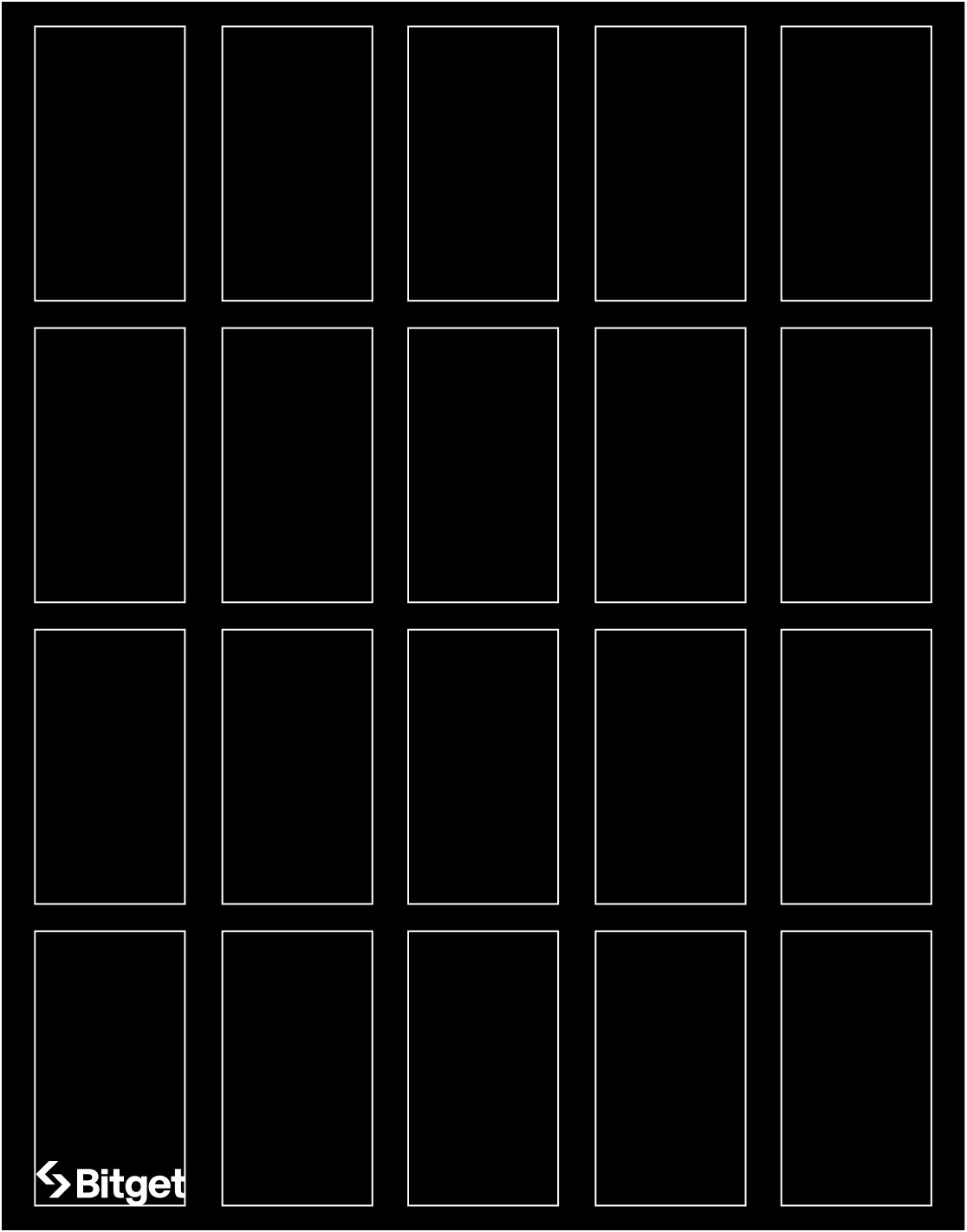
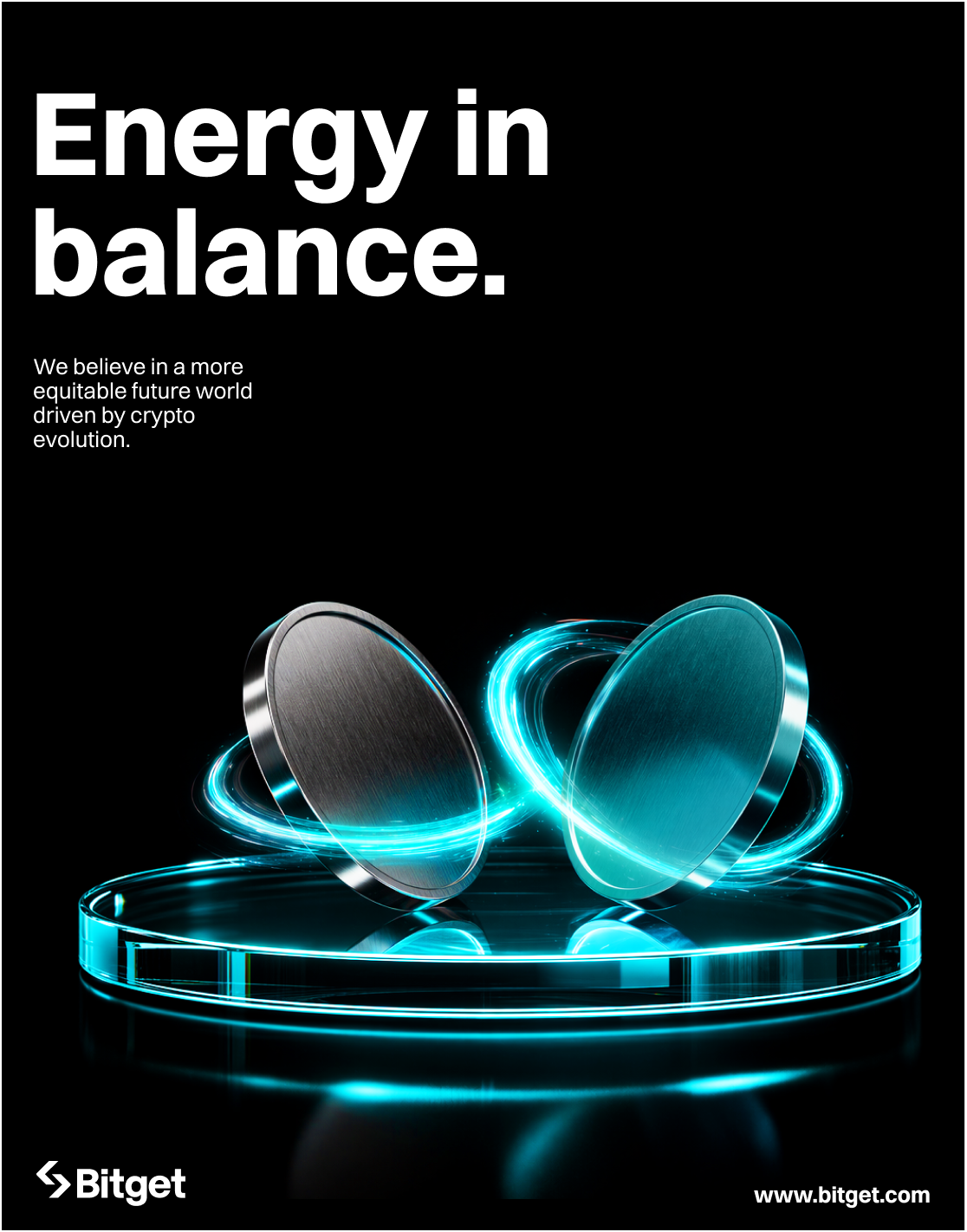
Layout Variant A
Typography as Hero
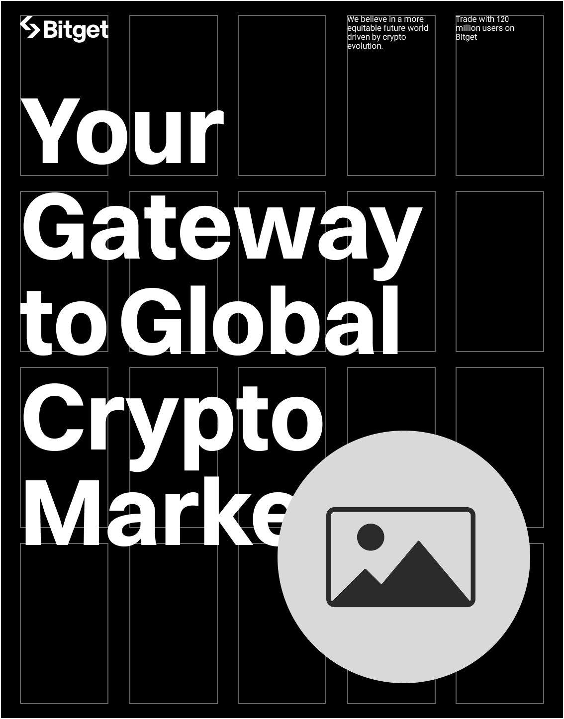

The headline fills the grid as the primary focal point. Typography is large and commanding. Imagery, when present, plays a supporting role within the composition.
Layout Variant B
Image as Hero
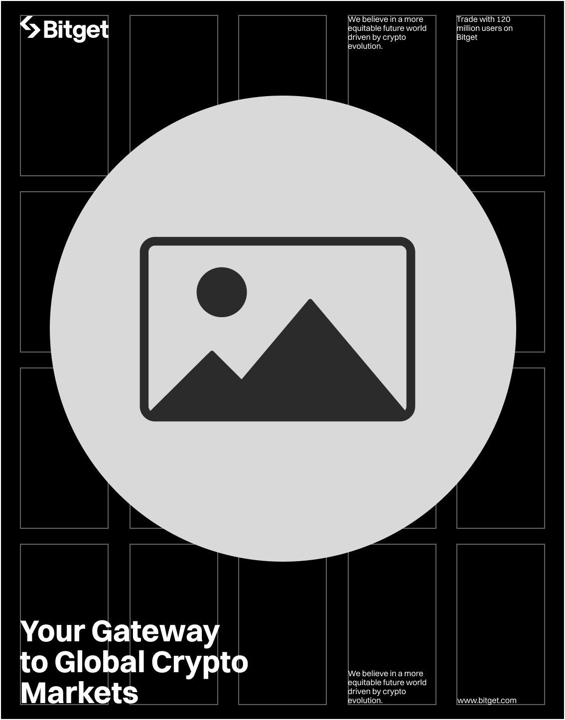
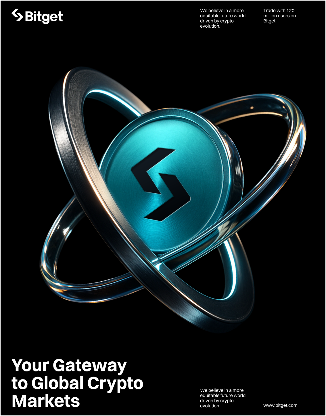
A single strong visual fills the composition. Text is reduced to a minimal headline or tagline, placed in a supporting position. Impact is driven through the image.
Layout Variant C
Image + Typography
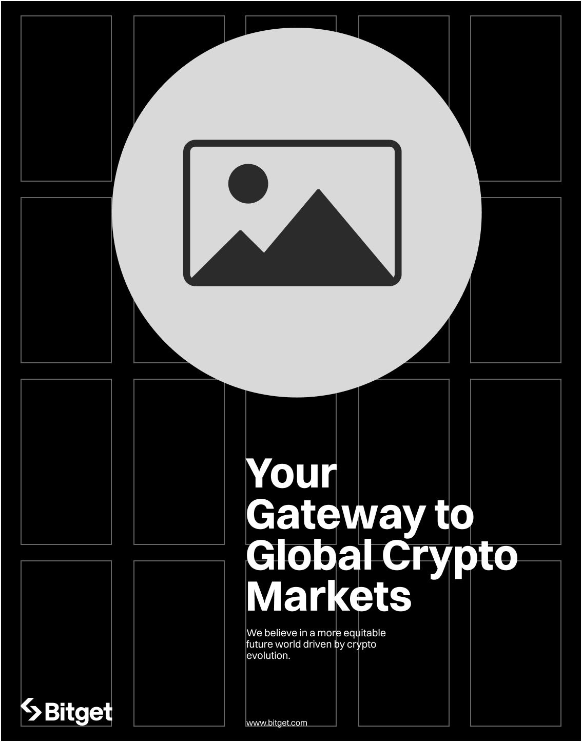

Text and image share equal importance. The grid is deliberately non-standard, influenced by Swiss design principles. The tension between headline and visual creates a modern, energetic composition.
Layout Variant D
Asymmetric Composition
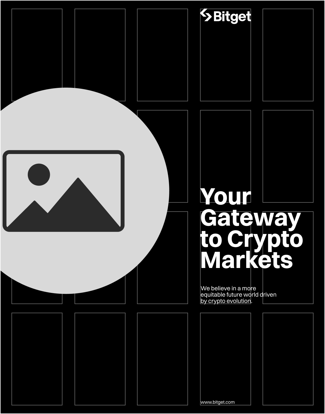
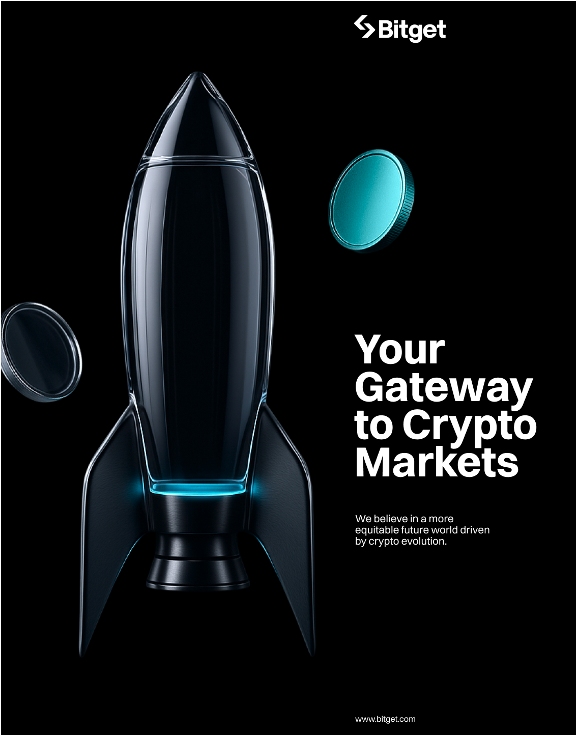
Image occupies an asymmetric zone of the grid while text anchors the remaining space. Deliberate imbalance creates visual energy and a distinctive, editorial feel.
02 — Marketing Horizontal
Marketing — Horizontal
Horizontal formats cover aspect ratios from 2:1 to 6:1, widely used in outdoor and digital media. For ultra-wide formats exceeding 6:1, specifications can be adjusted to maintain prominence of master brand assets.
Step 1: Divide the height into 5 equal parts. Use 2 parts as the logo size.
Step 2: Use the Exchange Mark as a reference to set the artwork margins.
Step 3: Divide the grid into 12 columns within the margins.
Logo placement: The Bitget logo is always positioned in the left corner to maintain brand recognition and visual balance. The Exchange Mark icon equals one grid unit (X).


03 — EDM
EDM Best Practice
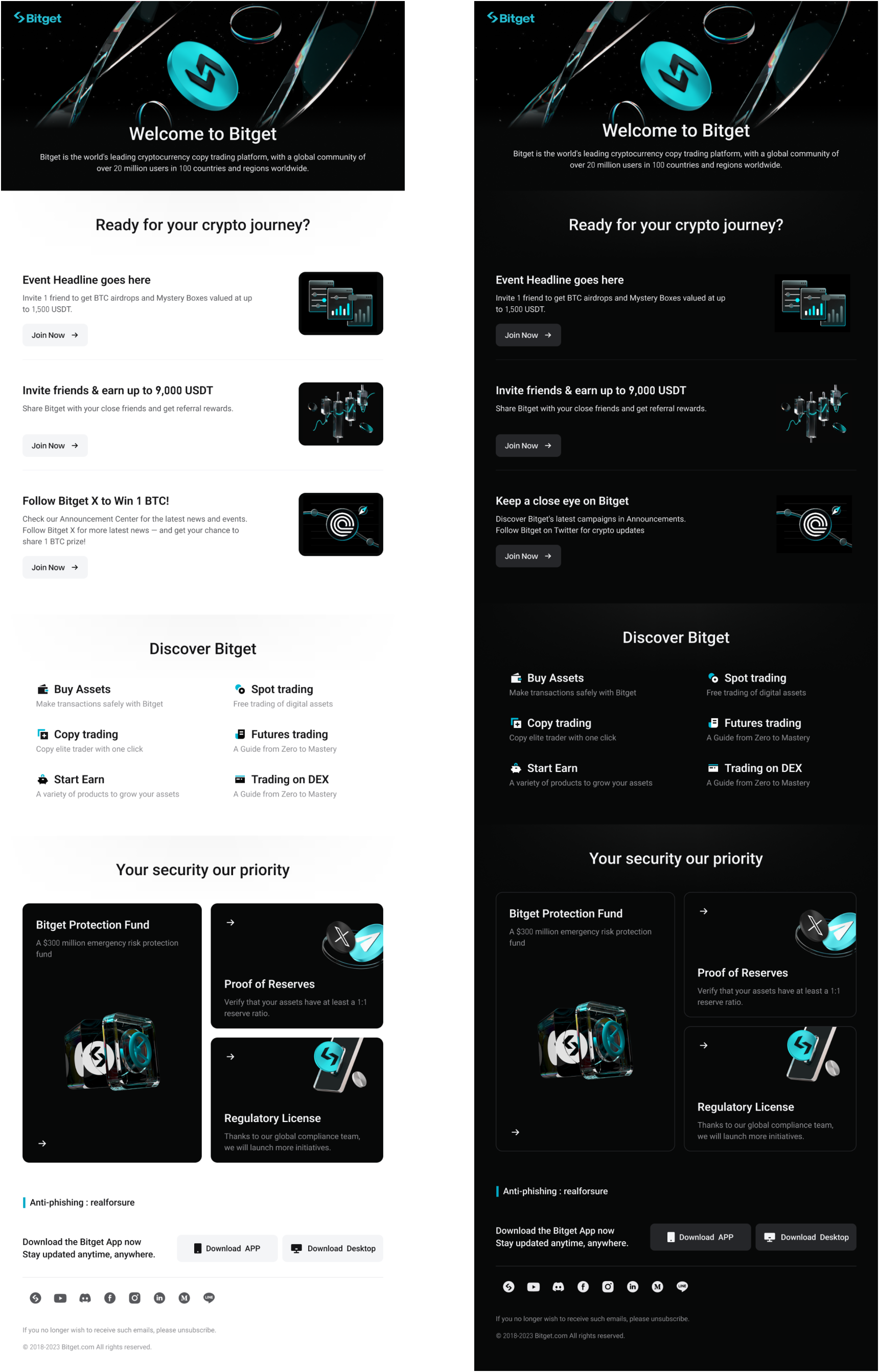
In EDM communications, the logo is always positioned at the top for immediate visibility. Keep content structured for a logical flow, use consistent typography and spacing for readability, and maintain brand colours and layout for a polished, cohesive look.