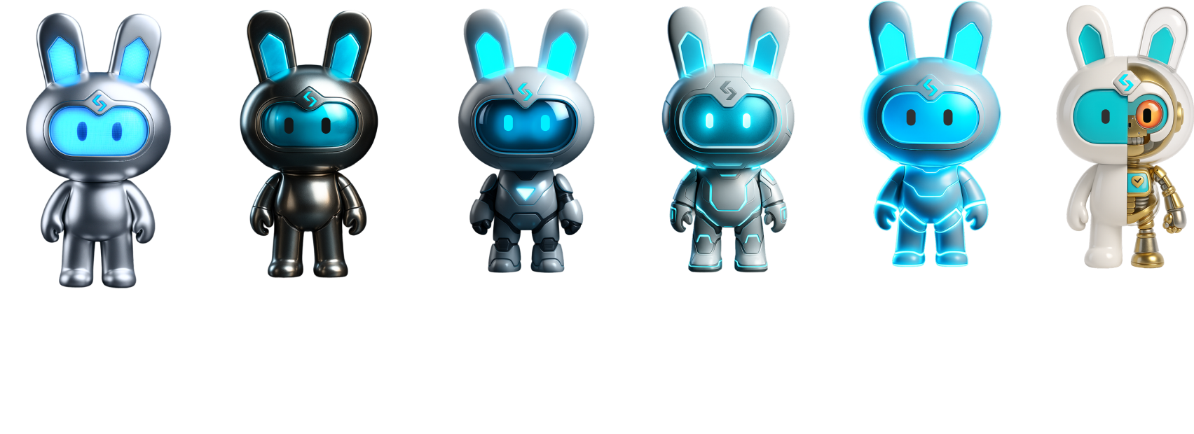

Built for Perfect Trades
Built for Perfect Trades
Built for Perfect Trades is more than a statement — it reflects our belief that a better trade is built through every part of the experience. From broader access to global markets and more efficient use of capital, to smarter tools and clearer decisions, we continuously refine the platform around what traders truly need.
Perfect trades are not defined by a single outcome. They come from having the right access, tools and opportunities at the right moment. There is no finish line — only a continuous pursuit of making every trade more seamless, confident and effective.
The same thinking shapes our brand and visual design. We think for the trade, create for the opportunity, and design for the moment. Rather than being defined by a single visual style, we let the purpose of each project shape its expression. Every major initiative is an opportunity to evolve — to challenge what came before and build a creative solution made specifically for what comes next. Consistency comes from how we think, not from making everything look the same.
Brand Design OS
One Logic. Infinite Expressions.
A strong brand is not defined by a fixed visual style. It is defined by a consistent way of thinking. Photography, motion, 3D, typography, illustration, AI, data visualization — no single style defines our brand. As long as every expression follows the same principles, every medium belongs to the same brand. Style evolves. Principles don't.
Brand Design Philosophy
We don't build recognition through repetition. We build recognition through conviction.
Every visual should make information clearer, strengthen trust and help users make better decisions. We create work that is distinctive, purposeful and always centred around the user — not trends.
UEX Design Principle
Design for Traders. Design for Opportunity.
Every design decision begins with one question: how does this help traders identify, understand or act on opportunities? Value before functionality, clarity before complexity, confidence before excitement. We don't just design for transactions. We design for decisions.
Intent-Based Design
Every element should earn its place. Nothing exists without purpose.
We Avoid
Generic stock imagery
Staged, artificial visuals that feel emotionally disconnected from real traders.
We Avoid
Financial clichés
Floating coins, generic candlestick charts — symbolic shortcuts instead of real communication.
We Avoid
Decoration without meaning
Graphics that fill space rather than carry information, logic, or intent.
How We Achieve This — Design Rationale
Four visual languages, each serving a different layer of trust.
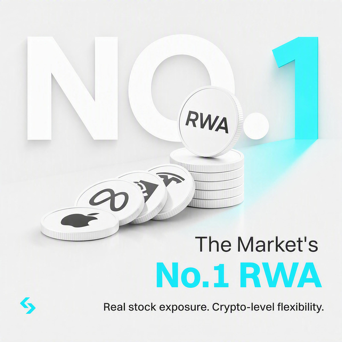
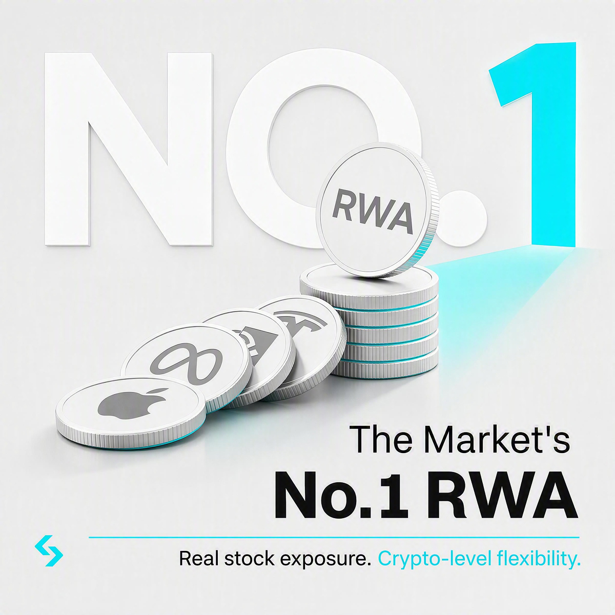
The light, industrial-grade series builds a sense of “safe to entrust.” Editorial delivers a one-second scroll-stop. The dark terminal proves “we understand professional traders.” The collage / distressed style builds emotional identification. Each is explained below, alongside exactly where and when it applies.
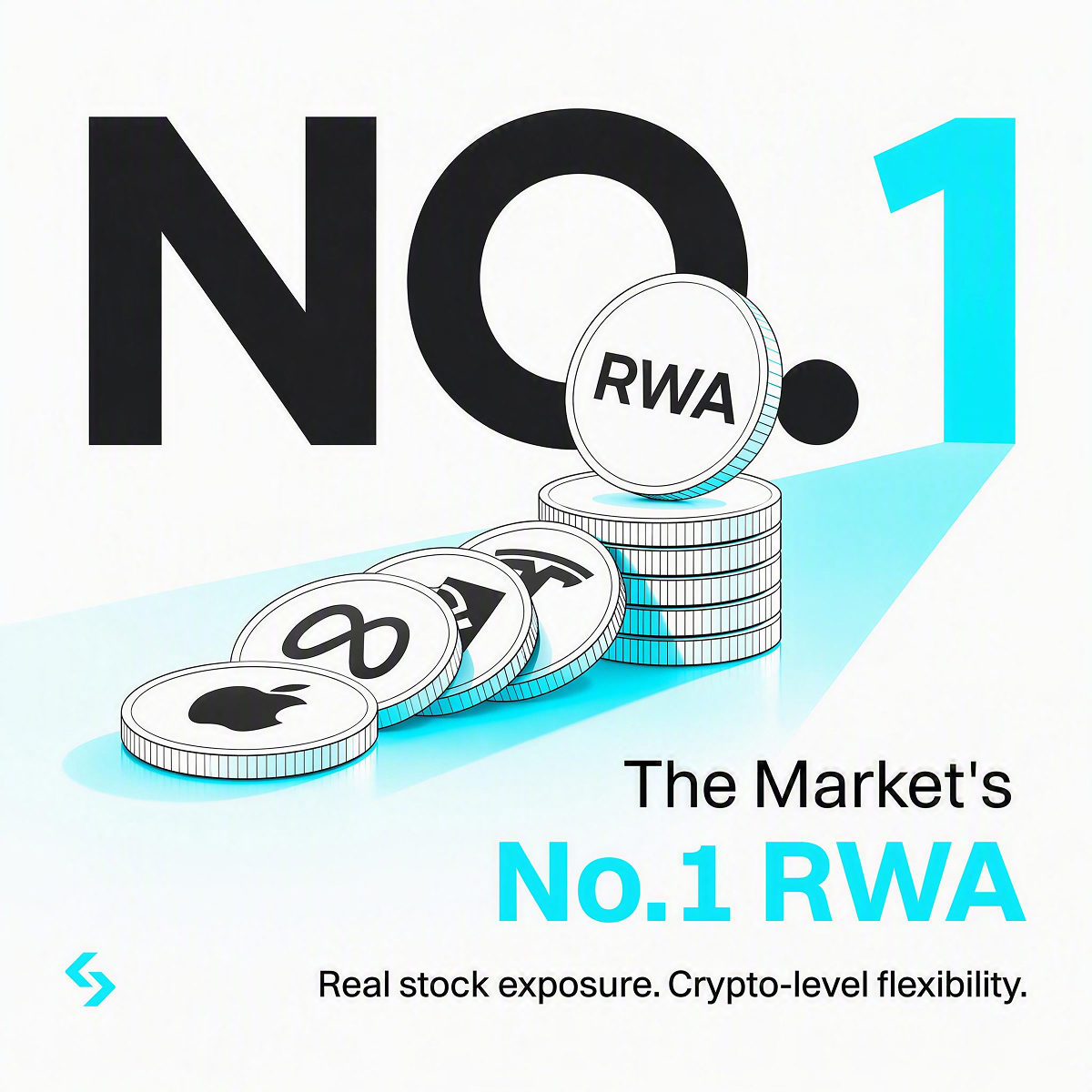
01 — Design Rationale · Light, Industrial-Grade Series
Trust, Made Tangible
An alternative visual direction, made for traders, made for users.

A visual territory for the next evolution of Bitget — white-first, engineered, human. Cyan is the signal, not the surface. Shown here as a moodboard exploration, distinct from the current dark system.
N° 01 — The Feeling
The touch. The control. Making the intangible tangible.
The inspiration comes from functionalist industrial design — matte polymer, soft-touch surfaces, satin aluminium, fabric mesh, mechanical dials. Objects you understand by holding them. Digital finance borrows this language so that value, for the first time, feels like something you can touch and control.


N° 02 — The Shift
A new world of assets requires a new kind of trust
Crypto, stocks, funds and tokenized real-world assets are converging into one digital ecosystem. Users are no longer only choosing what to invest in — they are choosing which platform they trust to connect them to value.
From
A fast-moving crypto trading platform
To
A trusted global system for accessing, understanding and acting on new forms of value

N° 03 — The System, Colour
White is the environment. Cyan is the signal.
Cyan never decorates. It communicates that something is active, live, connected or selected — a status light, a live chart line, a confirmed transaction. Because no cyan in the palette reaches text-contrast on white, cyan is never used for type: emphasis is carried by weight and by black, with cyan appearing alongside as a marker, bar or dot.
Three modes — how the palette is applied
Each mode fixes its own background, type and highlight values, so the decision is made once per context rather than per file.
01 · DEFAULT
Content & metrics
Reports, dashboards, articles, data tables, product UI.
48,201.66+2.41%
02 · KEY VISUALS
Key visuals
Campaign plates, posters, renders, social — pale grey lets white objects sit on the page.
8 YEARS2026
03 · SPECIAL CASE
Dark mode
Professional trading modes and select launch moments only �� never the default.
48,201.66+2.41%
Medium Cyan carries highlights on light backgrounds; Bitget Cyan is reserved for dark mode, where it reads at full strength. Cyan is never used for body type in any mode.
Pure White
#FFFFFF
Off-White
#F3F5F6
Pale Grey
#E9EAEB
Mid Grey
#9A9DA0
Charcoal
#2B2D2E
Black
#0A0A0A
Bitget Cyan
#00F0FF
Medium Cyan
#05C3DD
N° 04 — The Material
From glass objects to engineered instruments
Excessive glass, transparent coins and floating 3D forms are replaced by a tactile, dependable material language: off-white moulded surfaces, matte polymer, satin aluminium, rubber controls, mechanical buttons, small illuminated indicators.


Objects should feel useful, durable, precise — designed to be handled, built to last. White and satin surfaces; cyan appears only as an active state: a button, a marker, a small display.
N° 05 — The Signal, Information & Motion
Cyan is the active current moving through the system
A recurring graphic behaviour that stays recognisable without the logo: signal lines, calibration marks, ticker strips, serial numbers, technical coordinates.


The signal travels: cyan bands move through connections, numbers update mechanically, panels lock into place, indicators activate in sequence. Fast, but never frantic.
N° 06 — Photography Style
Every process and decision is backed by humans
Cinematic and observational, never staged. Soft natural daylight, cool-neutral balance, controlled contrast, real environments — the machine is trusted because people stand behind it.


Technology on one side. Nature and reality on the other. He bridges them.
The Architect represents experience, long-term thinking and system-level understanding. Nature is not decoration — it brings balance, human scale and a sense of permanence, keeping the engineered world from becoming sterile.


Ease, without anxiety
Users are shown paying, checking, comparing and deciding — naturally, in real environments. Freedom, ease of access, financial tools that fit into life.
02 — Design Rationale
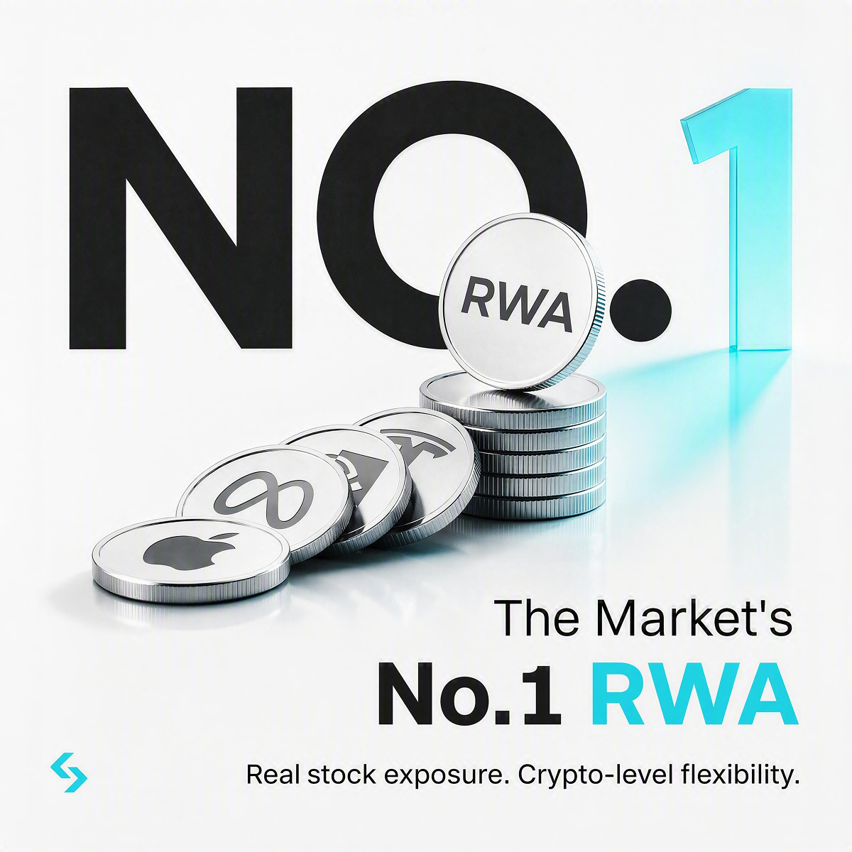
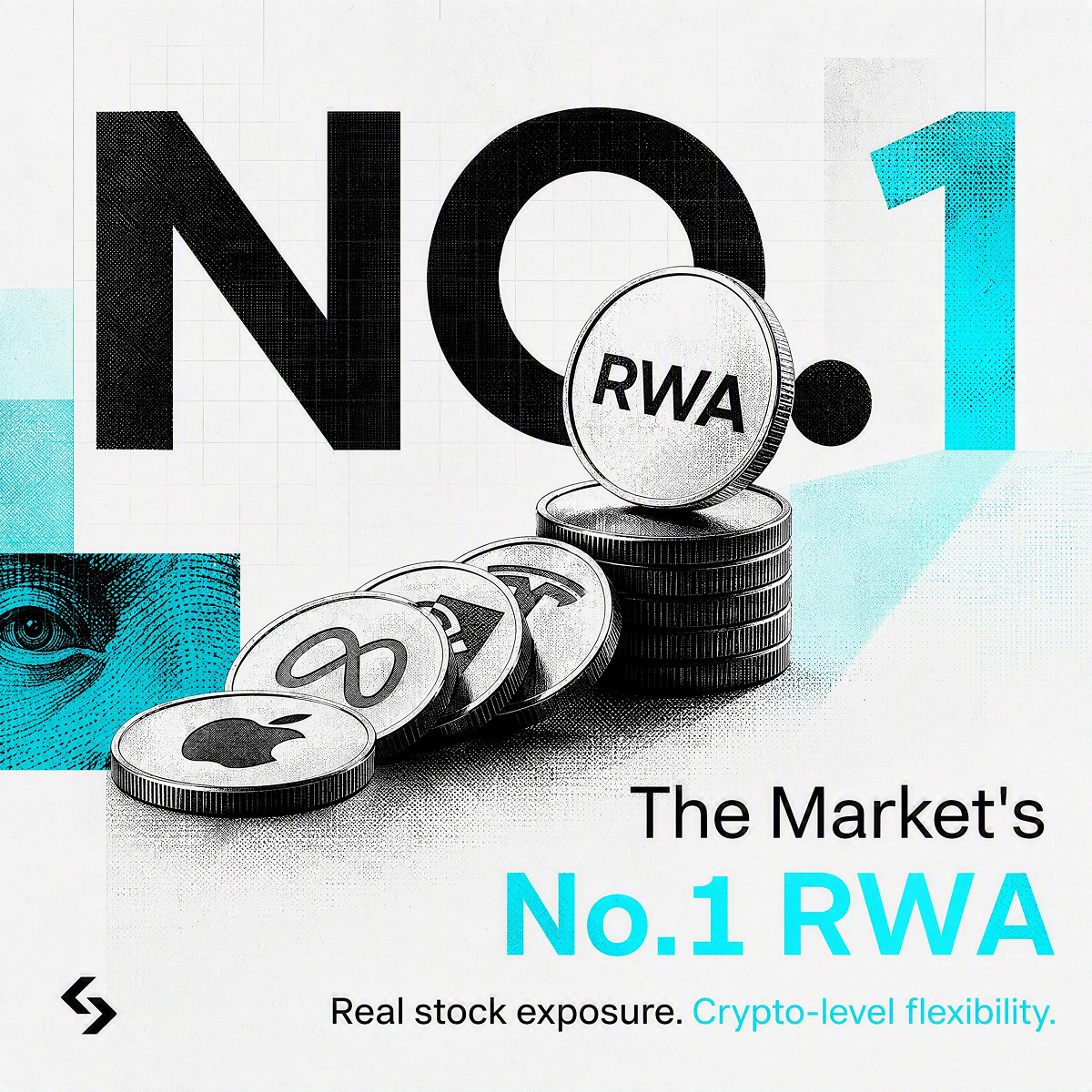
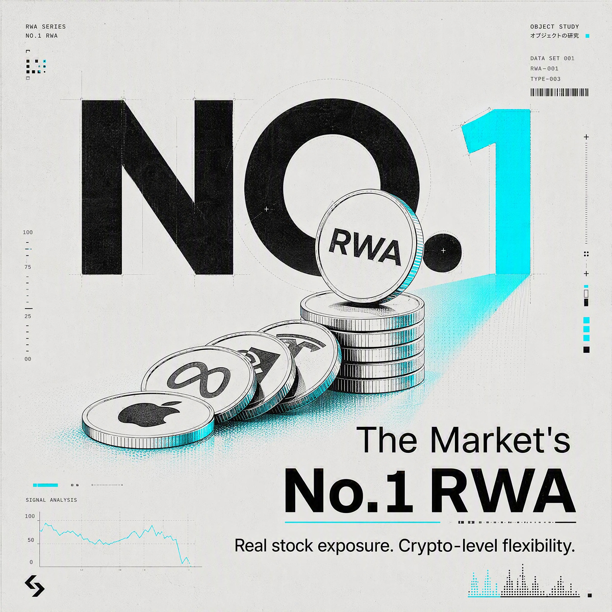
Editorial — Black & White with Cyan Accent, Bold Poster Style
High contrast, oversized typography, collage composition, negative space.
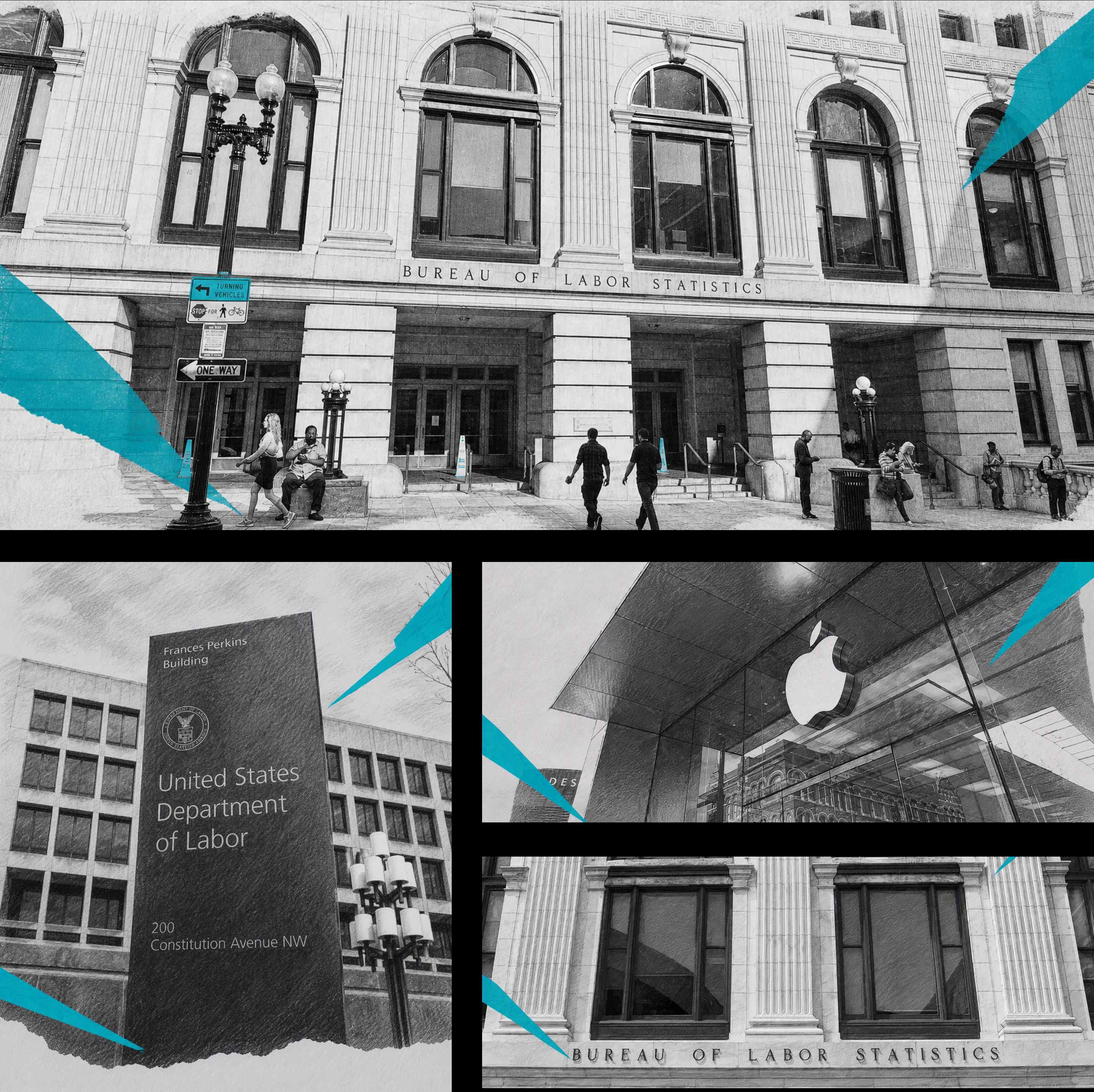
Extreme negative space and oversized type, built for a feed that never stops scrolling.
Why This Direction
Traders face information overload every day — dozens of exchanges, dozens of media accounts, endless flash news, all competing for the same attention. If UEX's content joins that pile of information, it will simply drown in the same noise.
Editorial style solves exactly this problem: extreme negative space and oversized type force every image to say only one thing. This isn't simplification for the sake of looking good — it's respect for a trader's time. They need content that can be grasped in a single glance while scrolling, not a manual that requires stopping to read carefully. Black and white as the base, with cyan used only for emphasis, ensures that when we truly want to highlight a number or a selling point, that emphasis is effective — not diluted by ten colors shouting at once.
This style serves UEX's moments of fast entrance — new listings, new feature launches. The attitude it conveys: we know your time is valuable, so we're only going to say the one thing that matters.
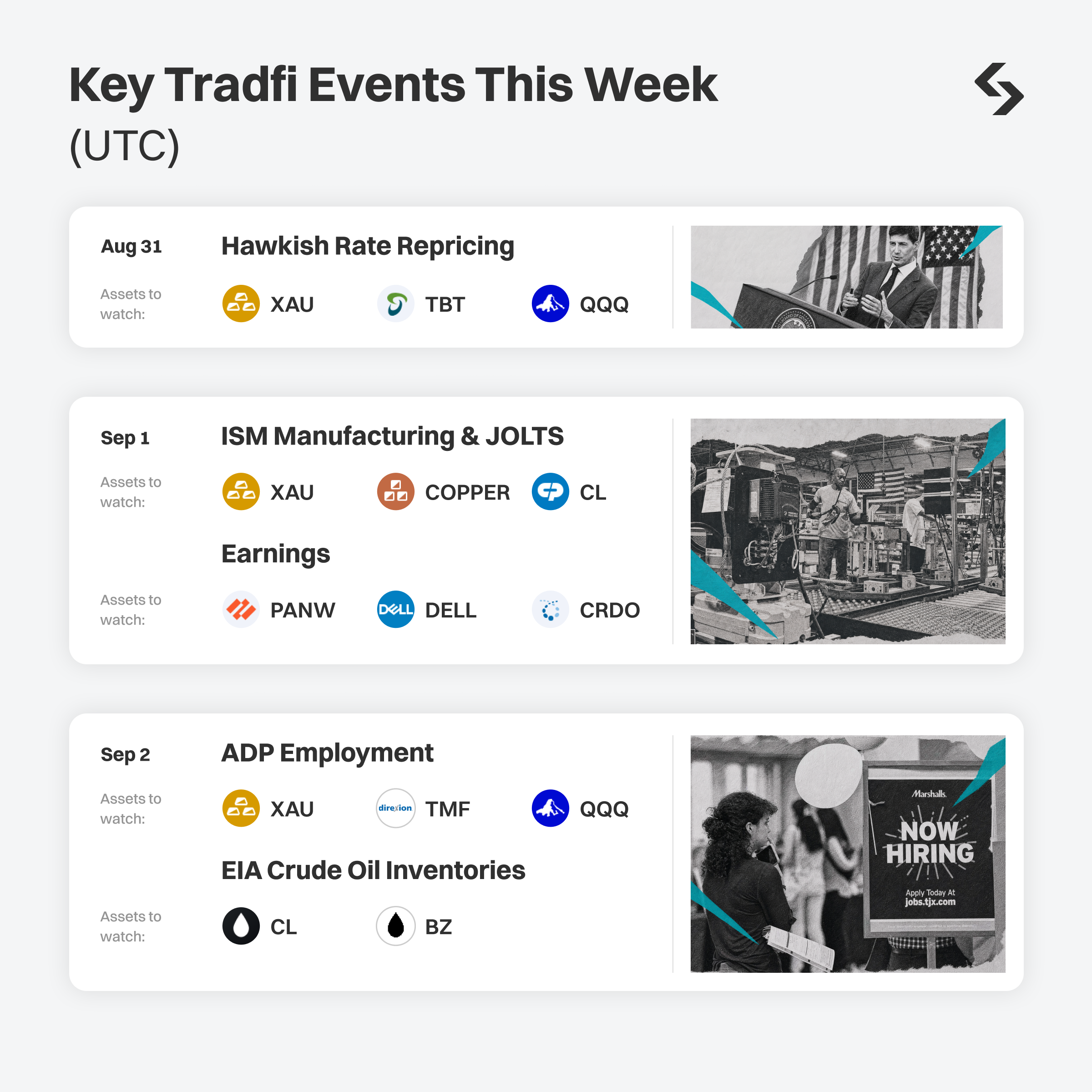


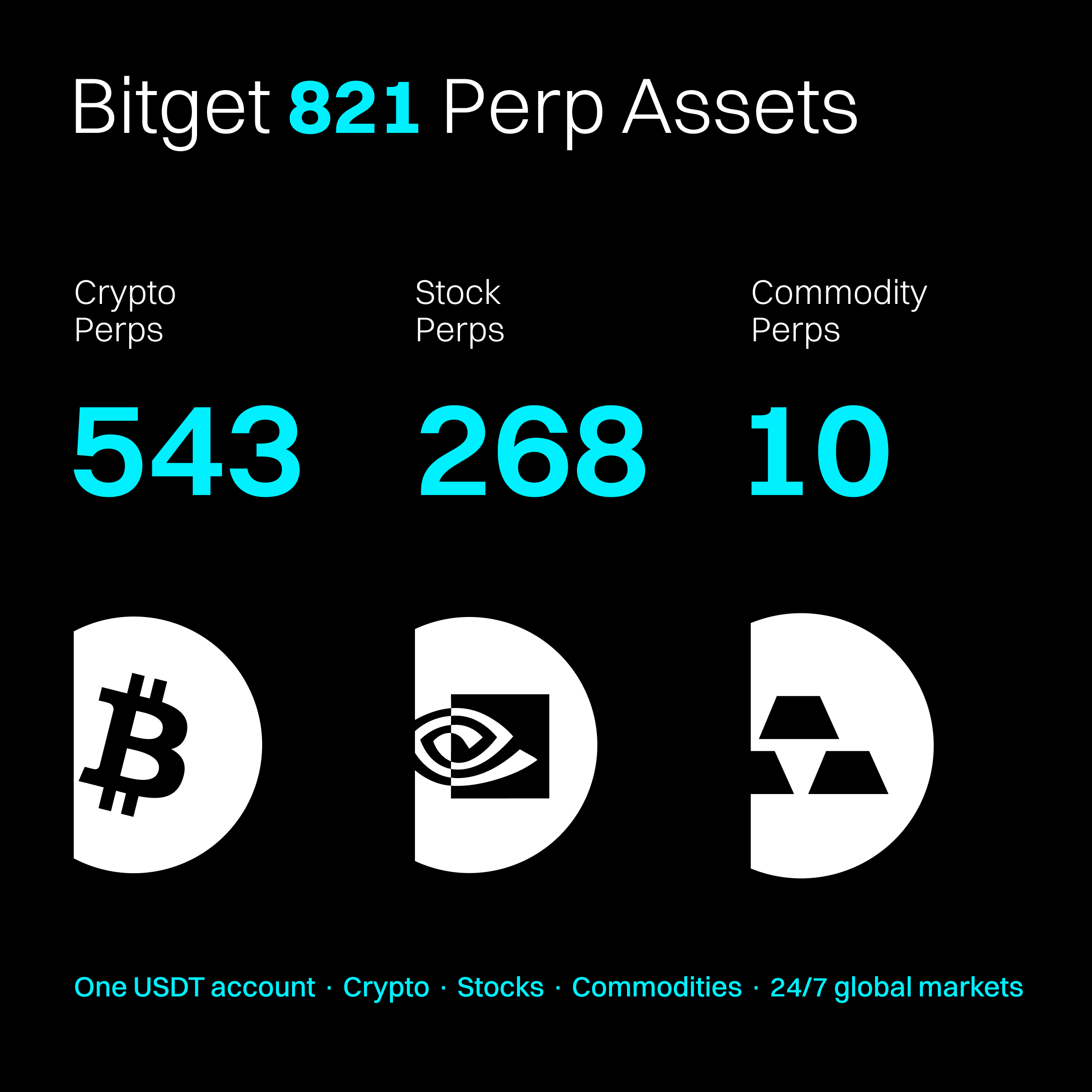
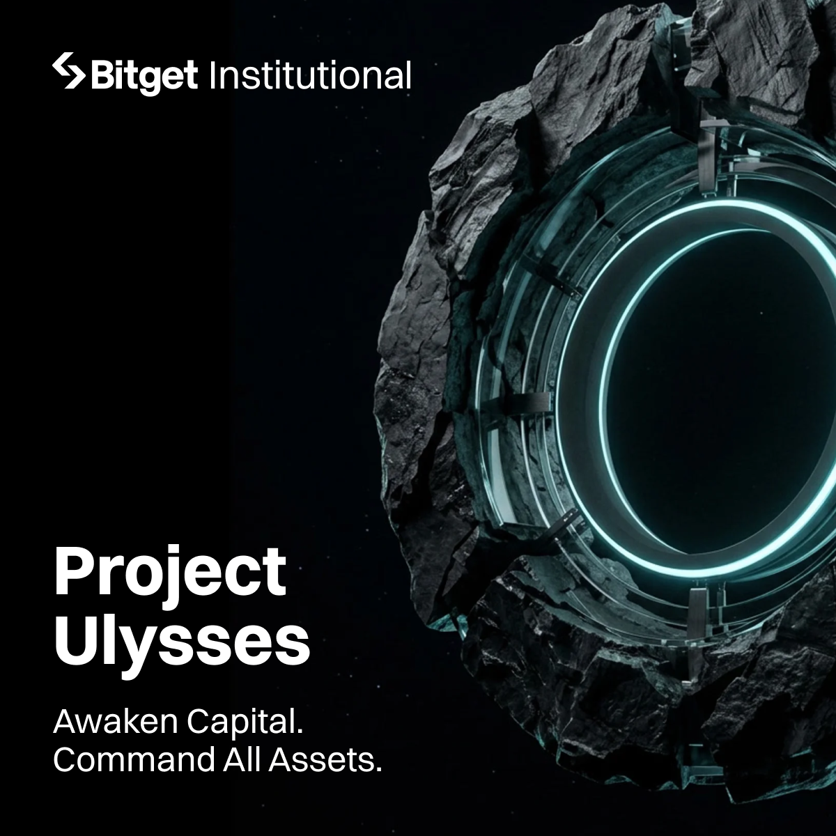
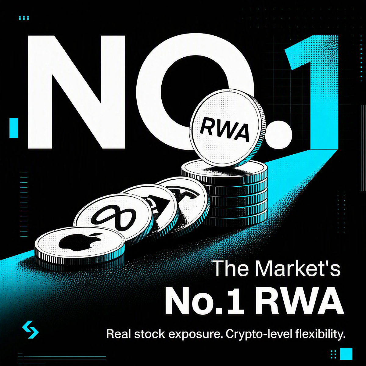
03 — Design Rationale · Dark Terminal / Data Dashboard
Dark Terminal
Dark background, cyan data highlights, professional terminal feel.
Why This Direction
Traders associate professionalism with clarity, precision and focus. Inspired by financial terminals, this direction uses dark backgrounds and bright cyan accents to create a focused, high-performance visual environment.
The highlights go beyond data — they can draw attention to key numbers, product benefits, CTAs and brand moments. It becomes a flexible visual system that reduces noise, strengthens brand recognition and makes what matters impossible to miss.




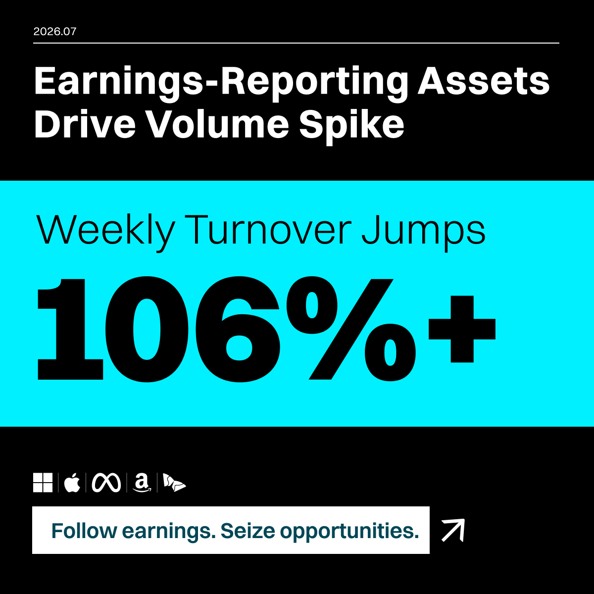

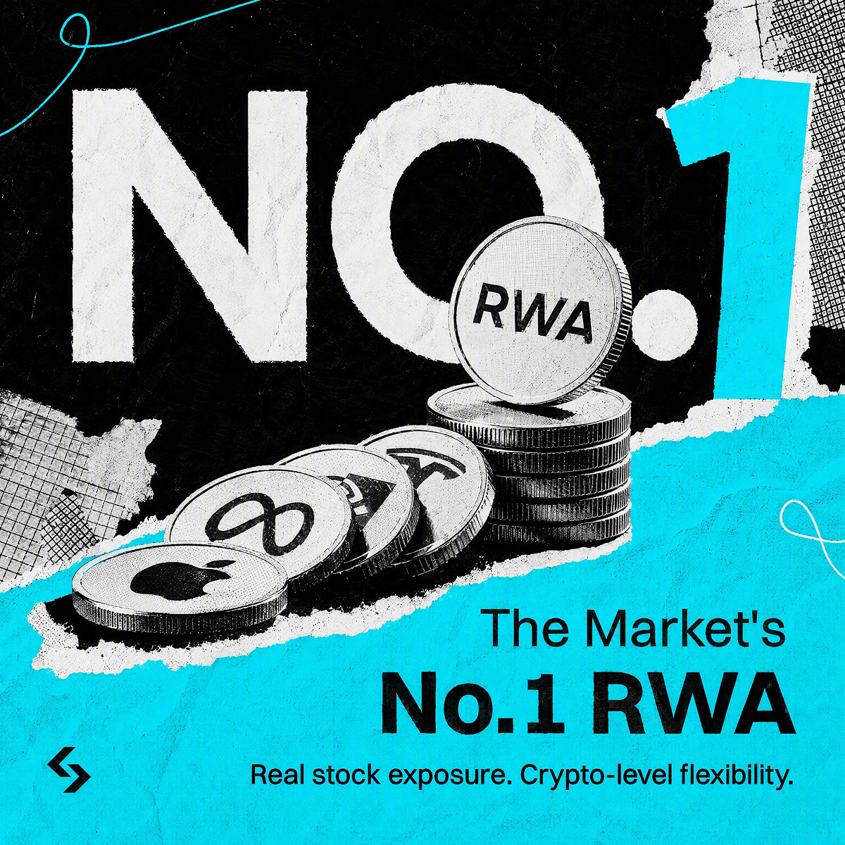
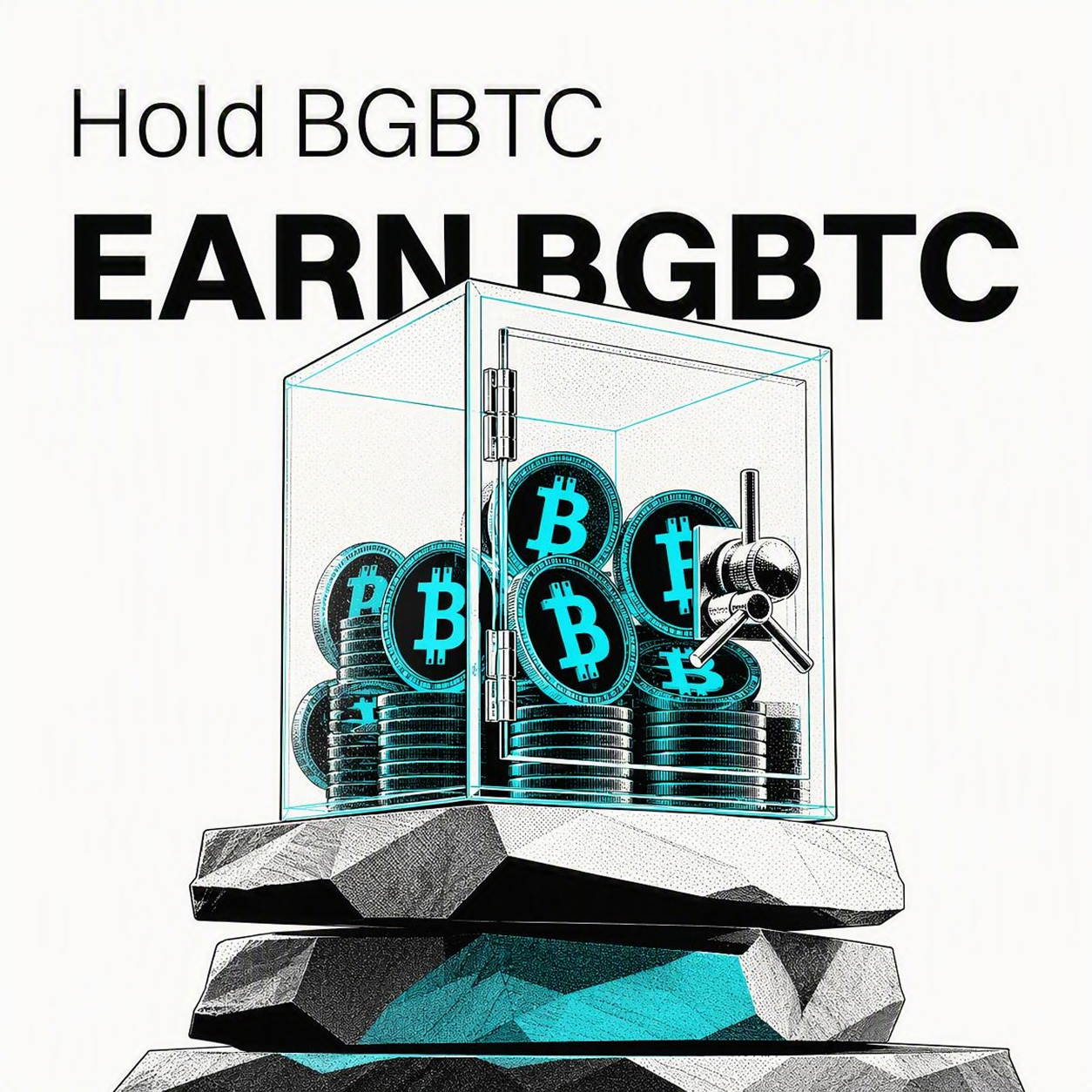
04 — Design Rationale · Collage / Distressed (Attitude-Driven)
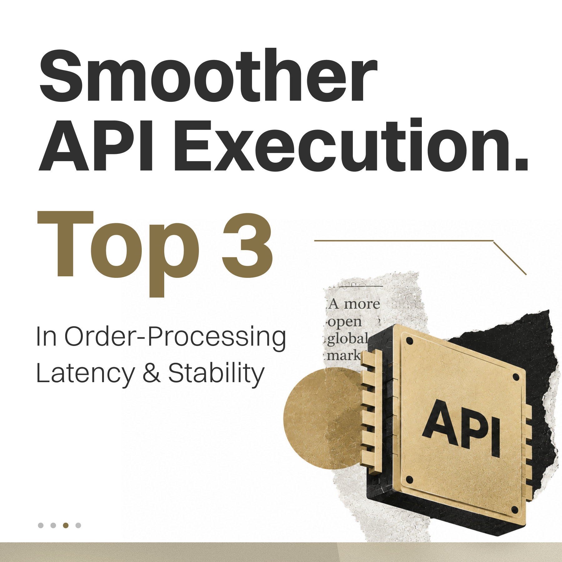
Collage / Distressed
Raw texture, torn edges, vintage print feel, bold attitude-driven layout.

Deliberately breaks the restraint of the other three styles to hold space for real trader culture.
Why This Direction
The first three styles all build one line: professional, credible, restrained. But traders have another side — the one that vents about a bad trade at 2am, that jokes darkly about liquidations and missed pumps. That kind of camaraderie is something pure professionalism can never reach. Collage / Distressed deliberately breaks the restraint of the other three styles — raw texture, torn edges, blunt, even slightly cheeky layout — to hold space for that rawer, more grounded trader culture. It isn't chasing “premium”; it's chasing the moment someone thinks, “that's literally me.” Its strategic role maps directly to our disruptor positioning: while competitors speak in the same polished, precision-commercial tone, we're willing to be more opinionated, more playful, and tell traders — we're not a stiff traditional institution, we get your dark humor. This style is mainly used for campaign merchandise and community-facing moments, built for emotional connection rather than trust credentials.


Four Expressions × Applicable Scenarios
Visual style can differ — every expression must serve a clear communication scenario.
01
Trust, Made Tangible
Brand-image content, strategic launches, institutional & investor communication.
02
Editorial
New listings, feature launches, fast-paced social campaigns.
03
Dark Terminal
Market data reporting, professional & quant-facing content.
04
Collage / Distressed
Merchandise, community content, disruptor / competitor campaigns.
Countless styles are possible — the right scenario for each is still ours to discover.

05 — Iconography
Brand Icons
Brand icons communicate core product features and concepts at a glance. They are always used in Bitget Cyan or white — never in secondary palette colors.

Brand Shield

Knight

Bullseye

Orbit
Copy Trade

Rocket
06 — Mascots & Characters
Bunz
Bunz is our brand mascot — approachable, energetic, and playful. Available in both 3D and 2D variants to suit different contexts.
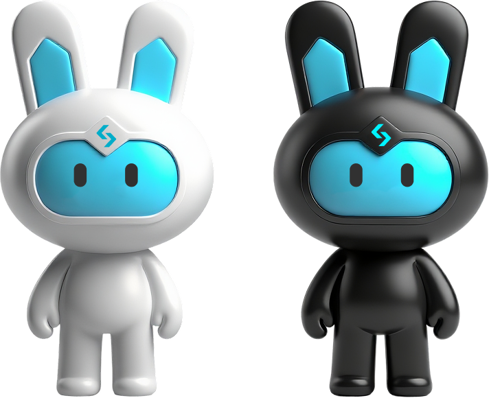
Bunz — 3D

Bunz — 2D