Logo
Logo System
Our logo is our first impression, and the face of the brand. We must uphold it to the highest standard and always maintain consistency, clarity and thoughtfulness in its application.
01 — Exchange Mark
Exchange Mark
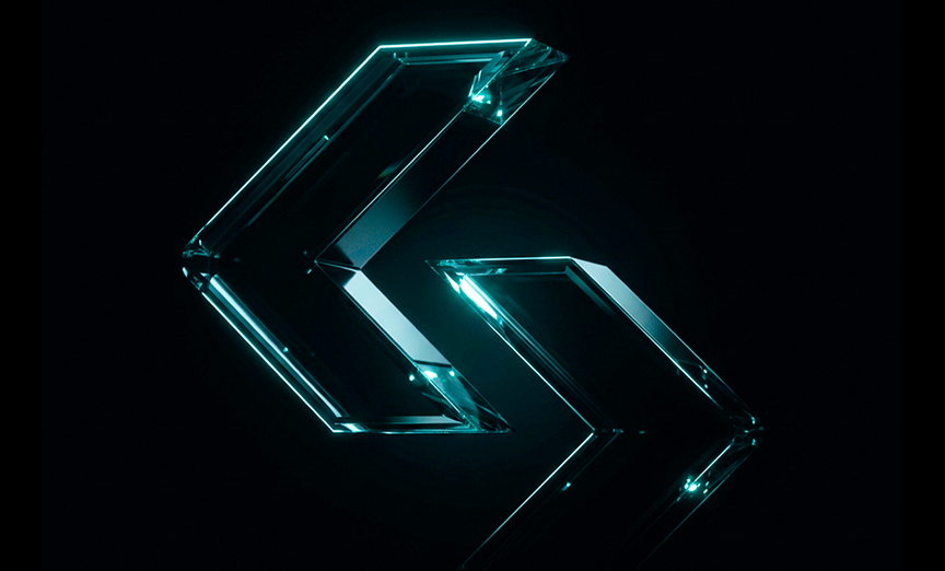
The Exchange Mark is the symbol icon for the logo, representing trading and the exchange of funds between entities.
The Exchange Mark can be used independently as an icon in digital products, favicons, app icons, and social avatars where space is constrained.
Exchange Mark — construction grid
02 — Primary Logo
Primary Logo
The Exchange Mark and Word Mark together form our primary logo. Use the horizontal version by default for consistency.
Horizontal — Primary · On Dark
On Dark (White)

On Light (Black)
Accent (Cyan)
03 — Clear Space
Clear Space
To ensure visibility and impact, the logo must always be surrounded by a minimum area of empty space defined by the height of the Exchange Mark.
The clear space rule applies to all logo variations — horizontal, stacked, and exchange mark alone.
Never crowd the logo with text, imagery, or other graphic elements within this protected zone.
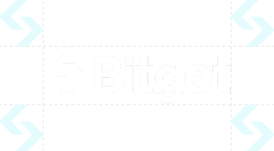
Clear space — minimum zone
04 — Stacked Logo
Stacked Logo
The stacked logo is used in constrained spaces or when a portrait-oriented format is required.
Stacked — Primary
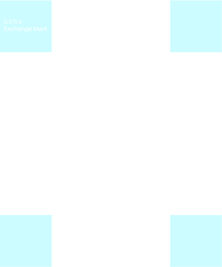
Stacked — Clear Space
05 — Logo Lock Up
Logo Lock Up
“Trade smarter” reflects our commitment to clarity, efficiency, and innovation.
Always use the provided tagline design when pairing it with the logo to maintain brand consistency.
Lock Up — Horizontal
Lock Up — Vertical
06 — Partnership Logo
Partnership Logo
In partnerships, the logo and partner logo are separated by a line, placed either horizontally or vertically.
For the Partnership logo, we can use the full logo or just the Exchange Mark.
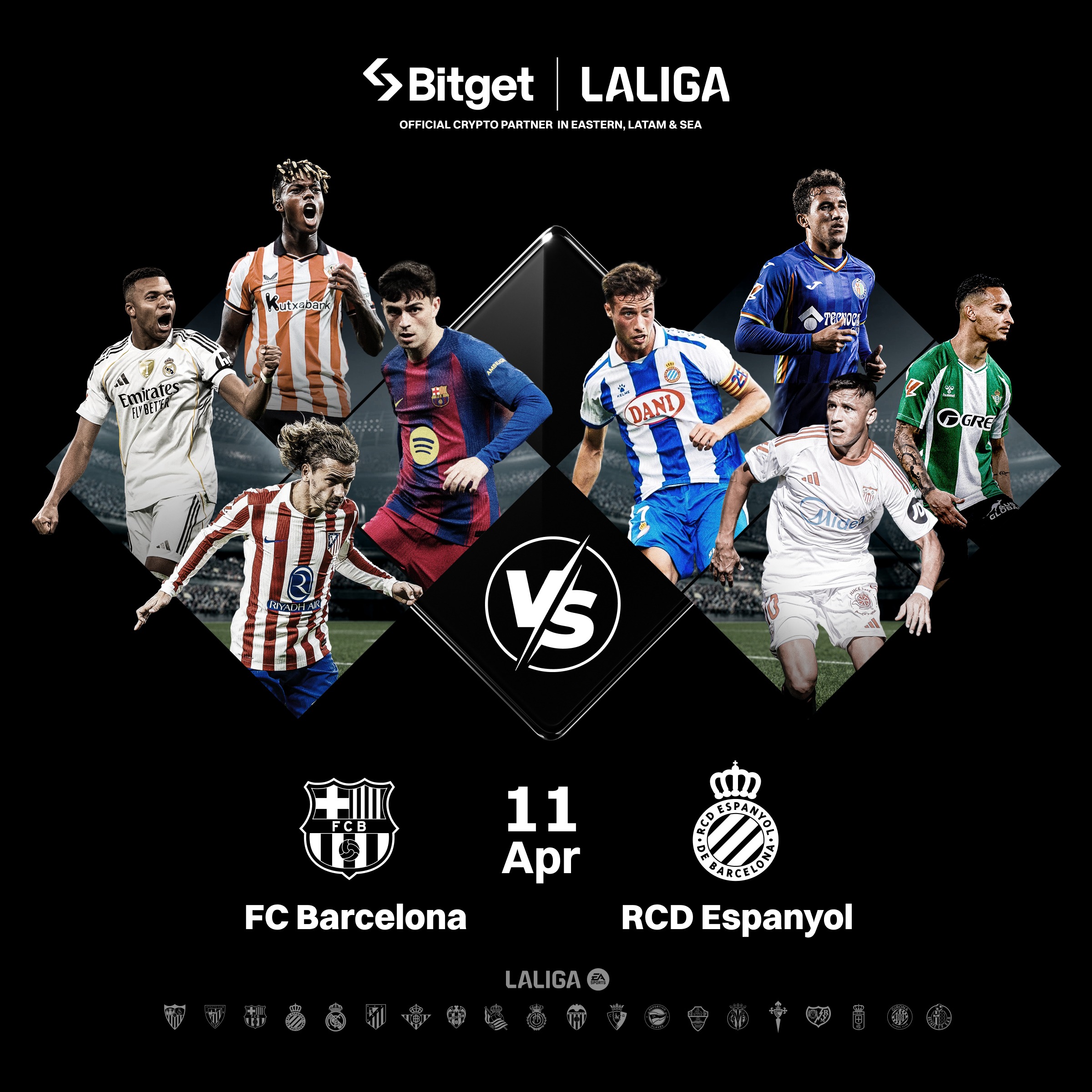

Horizontal — Full Logo

Horizontal — Clear Space

Mark — Stacked

Mark — With ×
07 — Regional Logo
Regional Logo
Regional logos combine the primary Bitget mark with a regional identifier. Always use the approved regional suffix format.

EU — Cyan Accent

EU — White Outline

EU — Horizontal

EU — Stacked
08 — Don'ts
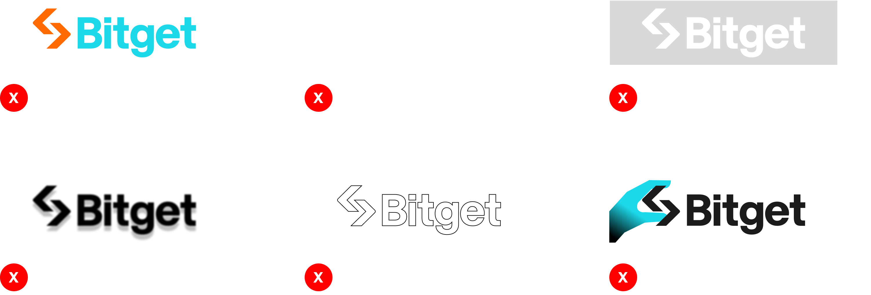
Logo Don'ts
Avoid these common mistakes to maintain brand consistency and integrity.